Callum stringer

Annual Restructuring dinner
As the lead designer for the Annual Restructuring Dinner, held at the prestigious Royal Arts Museum in London, I was tasked with curating a visual and experiential narrative that reflected both the exclusivity of the event and the evolving nature of the law industry. From concept to execution, my work focused on creating a refined yet modern atmosphere—integrating bespoke branding, immersive spatial design, and subtle nods to not only the royal academy of arts' unique architecture, but also the artist: Michael Craig Martin, of whom the firm licensed artwork from for the event.
The result was a seamless blend of tradition and transformation, echoing the evening’s creative theme.
Introduction
We wanted to incorporate several different routes for the client to choose between,
these options were to host an array of
different creative outlets, with each one utilising different aspects of the event.
In the imagery below you will be able to
see our initial starting point. Showcasing Martin Craig Martin's artwork throughout
the invitiation.
The firms brand guidelines are strict and
do not allow for external colour usage. Fortunately, I had noticed that a lot of
Michael Craig Martins work hosted a
similar colour palette to the firms.
Click the arrows to the right of the image to scroll through route 1


Route 1
Route 2

In the second route of this project I wanted to bring focus to the infamous venue that the event was being held at: The Royal Arts museum of London.
The Royal Academy of Arts isn’t just about
the art inside, it’s a living showcase of architectural evolution, blending:
-
Neo-Palladian roots from the early 1700s,
-
Sumptuous historical interiors and decorative artistry,
-
Contemporary architectural interventions that enhance usability while respecting heritage,
-
A graceful merger of two architectural eras through the adjoining buildings.
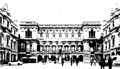
An outlined version of the museum was then created a basis for the second concept. The close comparison between the firms colour palette and Michael Craig Martin's work was something that I
wanted to further explore and possibly reference again.
I then introduced the firms colour palettes to see how the outlined building would appear with a colour wash. Although quite extreme, certain lighter colours worked well with the dark outlines of the building.
As you will see in the screenshot on the right, from exploring how each of the colours worked with the outlines of the museum, I ended up coming to the decision that all individual colours could work in collaboration. With different colours representing different pieces of collateral for the event.
As you will be able to see from the key at the bottom of the screenshot, each colour in the A&O Shearman colour palette represents a unique pillar of the firms structure, Whether that be the innovation represented by the blue, the excellence on display day by day, the sense of community the company emits, internally and externally.
All of these colours represent deep and meaningful messages, and to myself the more I could include whilst still keeping a great design was
a bonus.


Route 3
Building on the foundation of Route 2, this concept combines the use of individual colours from the firms colour palette to work in harmony across
one design, rather than separately across different collateral. Inspired by the architectural and cultural layers of the Royal Art Museums, the venue itself becomes a metaphor for the A&O Shearman brand. Each structural layer of
the museum is interpreted through one of the brand’s signature colour, subtly integrated to create depth, rhythm, and cohesion throughout the visual.
Route 3 creates an elevated and memorable look that captures both the
gravitas of the occasion and the creative energy of the firm.
This route in the end would become the chosen design for the 25th Annual restructuring dinner of A&O Shearman. I've included collateral samples below to show how the final work came to life.

Final design for the events dinner menu, which
will have been provided to all guests on the night


Final design for the A5 Invite, to be sent to all clients.


To the left is a collection of images from the event itself.
I take immense pride in having served as the lead designer for the
first-ever A&O Shearman Annual Restructuring Dinner—an event
of remarkable prestige and standing within the industry. It was
an honour to shape the visual and experiential identity of such
a significant occasion,
A special acknowledgment goes to Michael Craig-Martin, whose distinctive use of colour and form served as a profound source of inspiration throughout the creative process. Without his influence,
this project would not have come to life in quite the same way.