Callum stringer

Australia 15 year anniversary
In March of 2025 I was tasking with leading the creative direction for the 15th anniversary for the Australian office, this was to be a large scale event with an unique campaign needed to pioneer these celebrations.
About

For the locations 15-year anniversary, I set out to design a visual story that celebrated its journey through the heart of Australia. Drawing inspiration from the country’s rich landscapes, diverse culture, and timeless craftsmanship, the campaign became a tribute to where it all began, and how far it’s come. Each design route reflected a sense of place and heritage, blending modern expression with the textures and tones that define Australia’s identity.
The client had specific requirements that needed to be met, and had asked for creative input for how to turn these requirements into an exciting visual story.

Taglines
-
A new chapter awaits
-
Investing in tomorrow, today
-
Shaping the future together
-
Join us on an exciting road ahead
-
The future has never been more in focus
Route 1
A new chapter awaits
With the help of the teams creative copywriter, I came up with a set of unique taglines which could help formalise the events theme. How I personally find I work best is to come up with the creative language for a concept first, then I use this as the catalyst for imagery/themes etc. Often a single word within a tagline can evoke a feeling or moment which is far easier to generate imagery for than '15 year anniversary'.
With this method I can create a list of relevant taglines which have their own individual take on the events location/identity/culture etc. Once my preferred language is chosen I can base my imagery and colour palette etc around this. This can dictate whether my concept is based around a call to action, a celebration or something entirely different.
Supporting imagery:
The language for this concept focuses around a
bright and promising future, the chosen tagline for
this route was: A new chapter awaits, highlighting
a past whilst also focussing on a bright future.
I focused on a concept showcasing the exciting
journey ahead, which portrays individuals transcending upwards, this is to highlight the trajectory of the firm’s future. Another important focus of this imagery, is the perspective. The photos are typically taken behind/within close proximity to the individual who
is moving upwards. This is to make the viewer/client feel like they’re on the journey with the person transcending, and to avoid ‘being kept at arms
length’, which is a reservation the client had and something they wantedto be kept into consideration.

I also wanted to incorporate one of the brands unique monograms this specific monogram is the progress monogram. This is intended to highlight the journey accomplished so far, whilst also paying homage to the exciting future highlighted in the heading.
When incorporating a monogram, it is important to make sure it aligns with the theme and context of the concept. Due to us celebrating the next chapter and the future in this concept. We thought that the progress monogram would lend itselfwell to the concept.


Hero image:

Supporting imagery:
Route 2
Redefining legal excellence
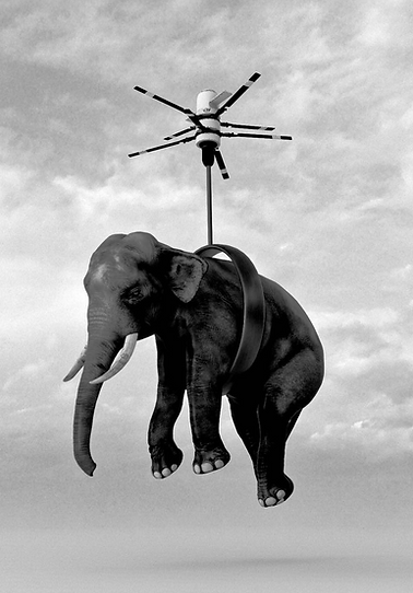
This theme centres on differentiation — showcasing how A&O Shearman stands apart in a crowded market. Inspired by the idea of “standing out,” it responds directly to the brand confusion with other firms and reframes it as an opportunity to celebrate what makes A&O Shearman unique. Through bold, distinctive imagery, this concept highlights the firm’s success through originality and confidence — because not many law firms would celebrate 15 years with an elephant flying across the sky.
The language for this route is focussed around being different and setting ourselves apart from everyone else.
Taglines:
-
Breaking the mold in legal services
-
Exceeding expectations, every time
-
Redefining legal excellence
-
Leading with integrity and excellence
Redefining legal excellence
For this route once choosing our tagline we wanted to explore more 'experimental imagery'. The client had made us aware of confusion in Australia between our firm 'A&O Shearman' formerly 'Allen & Overy' and another law firm called 'Allens'.
Obviously our outstanding law work speaks for itself, being a market leader and innovator in the law space. However, this still wasn't helping with this confusion.
So I thought the best way to deal with this was to utilise the brands unique look and feel by showcasing some of the firms more 'out their imagery'.


Following the same idea from the last concept, I wanted to include a monogram that was relevant to the routes theme and identity.
For this theme we wanted to use a different monogram, we focussed on the use of the ‘evolve’ monogram. It symbolises our effort
to consistently progress forward and redefine how a law firm looks, thus evolving.
The integrated monogram helps elevate
the design, and draw more attention to the unique character at the heart of the design.
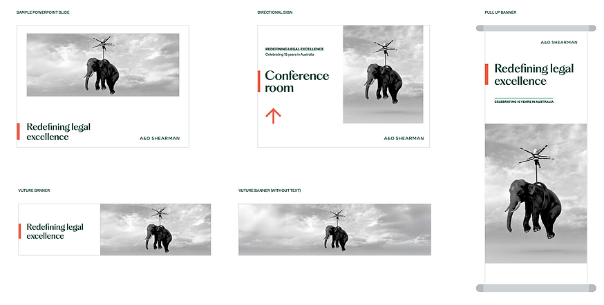
Collateral examples:
Route 3
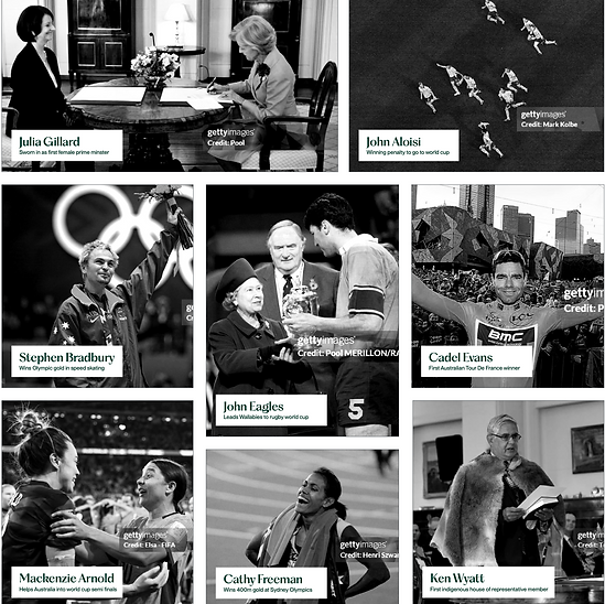
A legacy of achievement
As much as I felt the previous two routes covered all relevant objectives the client had raised, I wanted to add one extra route, something different that was a celebration of the countrie culture as opposed to a
sole celebration of the firm. As pictured to the right the celebration of Cathy Freeman, who was the first Aboriginal athlete to win an individual Olympic gold medal

Due to time constraints I wasn't able to build out this route to the same extent as the first two. However, the vision was still just as prominent in my eyes. By highlighting individual achievements by Australians in history, with a strong emphasis on sports (due to their televised element) and also due to the fact they garner more interest.
However, I still wanted to show a symbol of respect to the aboriginals of Australia and non sports related accomplishment achievers.
The main issue which I foresaw with this route was licensing.
Chosen route
A new chapter awaits
The chosen route in the end was the 'A new chapter awaits' concept. The client felt that this best represented the exciting future ahead for the Australia presence of the firm whilst also celebrating the successful past which got us to where we are today.

Final output examples:


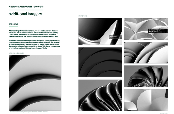
Additional imagery
Along with the full imagery suite for the 'A new chapter awaits' concept. The client also wanted to incorporate elements of Australia's pride/history within this concept, to make it more unique to the region. I knew we could have another unique concept to fit into this current style, so I decided to create an additional set of assets that could be used in conjunction
with the 'A new chapter awaits' collateral. These additional images are based around the Sydney Opera House, and its origins.